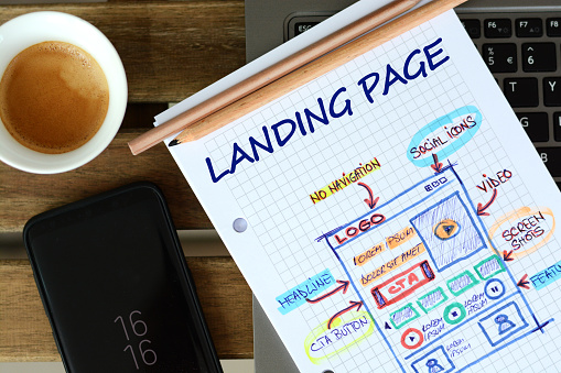
If you want quick lead generation and revenue increase, landing pages are the way to go. According to HubSpot, websites with more than 40 landing pages generate 12 times more leads. This is more than enough proof that landing page designs need careful thought and consideration.
Table of Contents
ToggleWhat Makes a Landing Page High-Converting?
As with most digital marketing strategies, landing pages is an amalgam of many factors. It is a blend of creative content, great graphic design, and tons of strategizing. The most effective landing pages have the following:
- Compelling headline and subheading
- A unique selling proposition
- An image or video
- Social proof
- Benefits to the consumer
- Call-to-action
Compelling Headline and Subheading
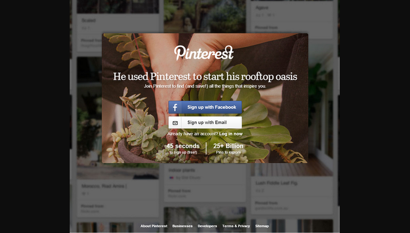
Your headline is where the action starts. After going this far in your advertising campaign, your prospects should read headlines that will further lead them down the sales funnel. Write killer headlines that will make visitors want to learn more. Pinterest hit the nail with this headline on one of their landing pages:
A Unique Selling Proposition
What makes you stand out from all the others? Make sure that your landing pages include your unique selling proposition to differentiate your brand from the rest. Your landing pages should be able to convince visitors that your brand is the solution they’ve been looking for.
An Image or Video
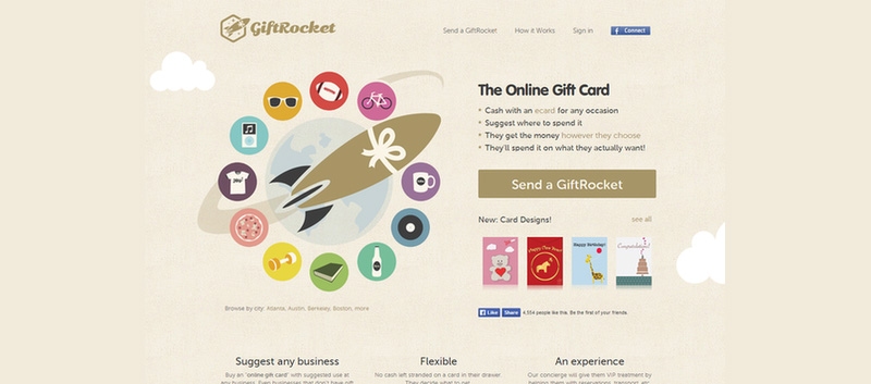
What better way to grab attention than the use of images and videos in your landing pages? This landing page from GiftRocket did it beautifully with an eye-catching graphic design. When you place an image on your landing page, it is usually the first thing visitors will see. Make sure that it captivates them to read through your content.
Social Proof
People will easily convert when they see others do it before them. This is the reason adding social proof to your landing pages are useful. You can add testimonials, feedback, reviews, or logos of your existing customers to show those that have trusted you with their business. SendGrid has done so with theirs, take a look:
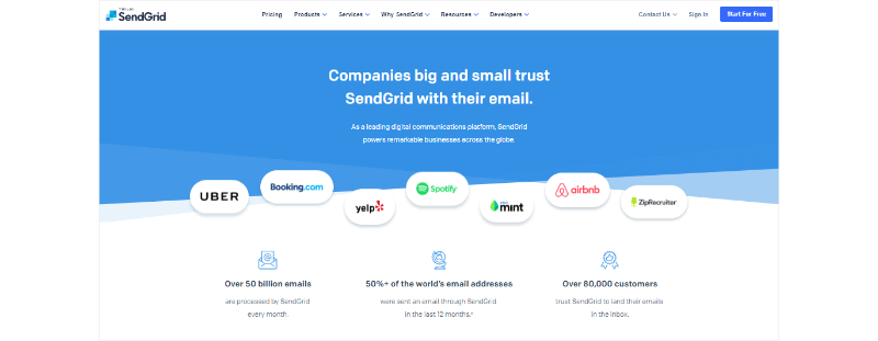
You can also use government certifications or the number of social media fans and followers you have. Also, experts’ stamps of approval are worth adding as social proof. This will give prospects peace of mind and give you a trustworthy image.
Also Read: Python: The Language of the Future
Benefits to the Consumer
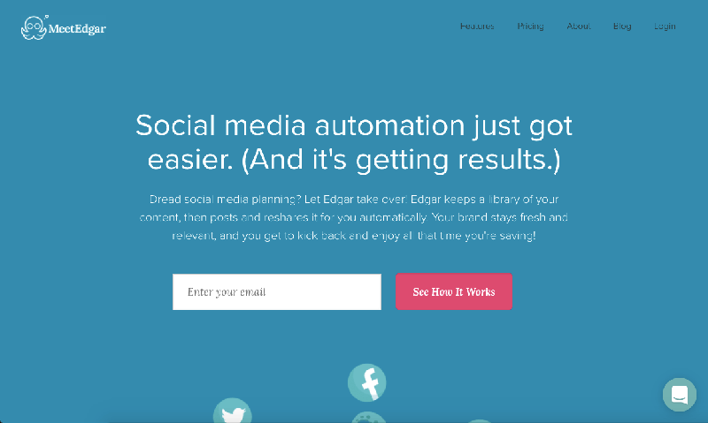
A good landing page focuses on what it has to offer to its customers. Instead of telling them all about your product’s new features, let them know how they can benefit from it. Let MeetEdgar inspire you to do the same:
Call-to-Action
For you to receive, you have to ask. A CTA or call-to-action is what will tell your viewers what to do next. You want them to click on this button, so make sure they do. CTAs such as Sign up now or Learn more are common, and it’s best if you come up with more creativity in it.
Make sure that the CTA is creative not just in the text perspective but also on the design. Please place it in a visible area. Use colors that show contrast. If still in doubt, consult a professional graphic designer.
Additional Tips in Creating Landing Pages That Convert
Keep these tips in mind when creating landing page designs for your business:
Choose Your Web Builder Carefully
A great landing page starts with an excellent web page builder. Whether you choose to go the automated way or hire a pro, consider your brand needs and go from there. Factors such as budget, goals, and expected outcomes should come into play.
Aim for Simplicity
It’s very tempting to include as many graphics or texts in your landing pages. You want to make use of the space as economically as possible. However, this can result in cluttering which can turn away potential customers. Make sure that your landing page layout has white space to make it more visually appealing.
Avoid Adding Navigation Elements
Keep your landing page to a minimum. Avoid asking your visitors to click on the next page as this will likely make them lose interest. While adding white space to your layout is ideal, your landing page has to hold all the information your visitors will ever need.
Use A/B Testing
Once satisfied with the overall design and functionality of your landing page, test it. Determine its performance and see what you can change or improve on. Create a new version if needed and see which will give you the best results. Never be afraid of experimenting to know where you need work and where you’re getting positive outcomes.
Also Read: Social Media Website Building Cost in 2021
Final Thoughts
Landing pages are powerful tools to convert leads into paying customers. Make sure to do it right with these landing page design samples and tips that help increase your sales.
Shashi Teja
Related posts
Hot Topics
Understanding TruthFinder’s Background Check Features
Background checks have become increasingly relevant for personal safety and information gathering in digital environments. TruthFinder offers comprehensive background check…
How MLOps Is Shaping the Future of AI in Business
Artificial intelligence (AI) has evolved from a futuristic idea to a strategic necessity for companies looking to innovate, grow, and…

