Unsubscribe Pages: If you are trying to grow your email list, then you already know that getting email unsubscribes is simply part of the process.
However, receiving an unsubscribe request doesn’t mean it’s the end of the road. Rather, it presents you with an opportunity that can benefit both you and your subscribers.
Read the rest of this article to discover 10 tips to use on your unsubscribe page that will decrease your unsubscribe rates.
Table of Contents
Toggle1. Prevent Future Unsubscribes
There are many reasons why people unsubscribe, such as:
- They need a break
- They changed their email address
- They get too many emails
- They’re taking a vacation
- And many other reasons
According to Campaign Monitor, the average unsubscribe rate for emails is 0.17%. This number can vary depending on a variety of factors, such as your industry, company size, etc.
And while you might not want to let any of your subscribers go, it’s necessary (and legally mandated) for you to do so.
But, there’s still a lot you can do to help prevent people from unsubscribing for similar reasons in the future. For instance, you can use hard unsubscribe pages to get feedback from users about why they are leaving.
You can then use this information to minimize the likelihood of others unsubscribing for the same reasons in the future.
Here is an example of an unsubscribe page from ABC Widgets:
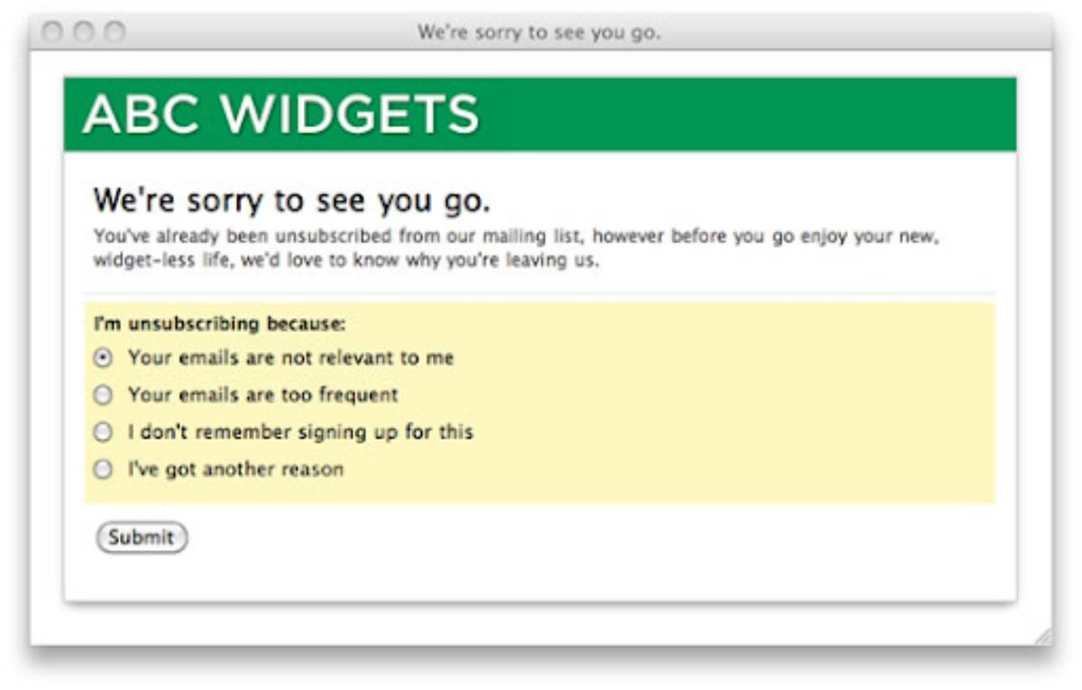
Notice how the page makes it clear that the person has been unsubscribed before asking them to share the reasons why they chose to leave.
Also, the choices for the survey are simple and limited in number, which makes it easy for readers to make a quick selection and submit the form.
2. Minimize Accidental Unsubscribes
Sometimes, people unsubscribe by accident, especially when you have one-click unsubscribe buttons.
For example, someone might accidentally click the link as they scroll through their inbox. Or, a user might hit “Unsubscribe” because they are getting too many emails and want to know what their options are.
In such cases, you need to have measures in place to ensure that only the people who really want to unsubscribe are taken off your list.
One way to do it is by using a pop-up that asks users if they are sure they want to unsubscribe.
If they select “Yes”, then you can be sure that you’re only removing subscribers from your list who genuinely want to leave.
Pro Tip: If you want to offer one-click unsubscribes, make sure you offer a way to undo it for those who didn’t intend to leave your list.
3. Use Friendly and Humorous Tone
Another way to help you make the most of your email unsubscribe page is to use a friendly and humorous tone in the copy. Although email marketing trends change constantly, you’ll never go wrong by using friendly and humorous copy on your email unsubscribe page.
Check out this example from the popular menswear brand, Bonobos.
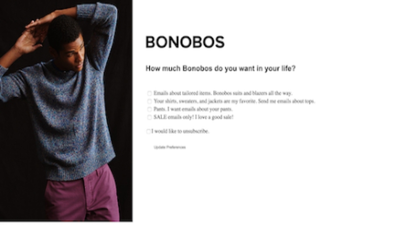
This is a great example of an unsubscribe page that you can steal for your own emails campaign. It’s effective because it uses humorous one-liners to lighten up the situation which helps to leave readers with a strong positive impression of the brand.
4. Add a Personal Goodbye
Adding a personal goodbye to your unsubscribe page is a great way to encourage users to stay. In your copy, show some personality so your would-be unsubscribers don’t forget you.
Make sure you are friendly and gracious when saying goodbye. Don’t burn bridges, always part ways on good terms. Give people a good experience and they will remember you fondly.
Even in the event that they still decide to leave anyway, a personal goodbye message helps to strengthen your relationship with them.
When you make your messages personalized for your customers and clients, you welcome to return anytime, making it a lot more likely they will engage with your brand again in the future.
5. Offer Incentives to Encourage Users to Stay
Another way to turn lemons into lemonade with regard to email unsubscribe pages is to offer incentives to keep users subscribed.
There are many different ways to encourage email subscribers to stay on your list, such as:
- Offer Discounts: Discounts are a great way to entice people to stay subscribed. For instance, you might have a pop-up offering a 25% discount on their next purchase if the user chooses to stay.
- Remind Subscribers What You Have To Offer: Unsubsribe pages are a great place to highlight resources, platforms, and content from your brand that subsribers may not even know you have. For example, you can create a list with social media channels, podcast directories, online course course platforms, on-site blogs, and everything else you offer your subscriber with your email updates and newlsetters.
- Offer a Frequency Downgrade: Sometimes people hit the “unsubscribe” buttons as a way to reduce the number of emails they are getting. They might choose to stay on your list if you offer a frequency downgrade where they receive your messages less often.
- Offer to Personalize Their Subscription: Yet another smart way to approach unsubscribes is to offer alternatives to personalize their subscription. For example, instead of sending them weekly or monthly newsletters that contain various types of content, you might give the subscriber category-style alternatives where they’ll only receive the type of content and promotions that appeal to them.
Here’s how Grammarly does it:
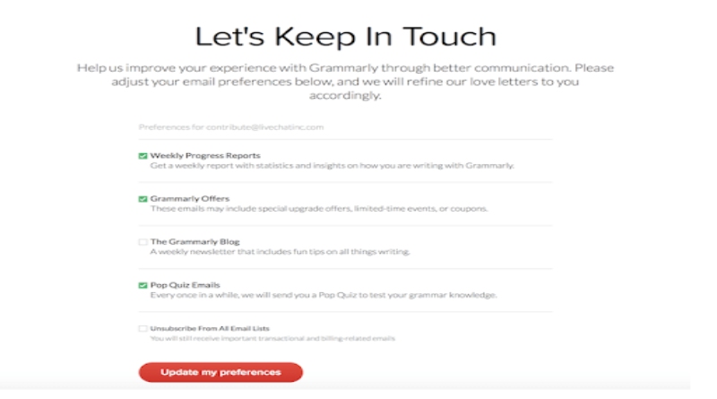
The brand offers to improve customer experience by sending different emails where subscribers can choose the type of content they get from blog posts and Grammarly offers, to progress reports, pop quiz emails, and more.
6. Encourage Unsubscribers to Follow You on Social Media
If someone is absolutely set on leaving your email list, there’s no reason to give up. You can still encourage them to connect with you on social media.
Make sure your email unsubscribe page is branded and includes social profiles and other digital marketing channels to keep them engaged with your brand even if they unsubscribe from one channel.
This will give you a chance to continue a relationship where you can nurture them, build trust, promote user-generated content for better engagement, and hopefully bring them back to your site to make a purchase – all without cluttering their inbox.
This is a simple, yet effective tactic that should be included in all unsubscribe pages. Check out this example from the popular brand, Brighton.

7. Don’t Make People Log In to Unsubscribe
The last thing you want is for your customers to leave with a bad impression, so make sure your unsubscribe process is simple and quick.
It’s legally mandated to allow the people on your list an easy way to unsubscribe from your emails at any time. But even more importantly, you should make it easy to unsubscribe so that you don’t annoy users, thereby lessening the chances that they might resubscribe in the future.
Don’t force your subscribers to log in in order to unsubscribe from emails. This is a quick way to get your emails marked as spam if someone either doesn’t remember the login information or they simply don’t have the time to fill out a form.
Being marked as a repeat spam sender is something you must avoid at all costs because it will negatively impact your deliverability rates.
Email providers check spam reports regularly, and if they flag you as an offender, it increases the chances that more of your future correspondence will end up in the spam folder.
However, email marketing tools like Aweber use algorithms that help make sure your emails land in the inbox and not the spam box. But even when using these tools, subsribers can still tell Gmail or other email providers to mark all future emails from you, your brand, or business as spam.
Enough of these reports could even lead email providers to mark your address as a spamy address and prevent your emails from getting to subscribers that actually want to receive them.
So don’t take any risks. Make it easy to unsubsribe. It’s better to lose one subscriber than risk email providers marking your address as spam.
8. Don’t Make Surveys a Requirement
Some email senders make it a requirement to complete a survey before the user can unsubscribe. This is yet another quick way to land in the spam folder.
If someone doesn’t have the time or desire to fill out your survey, marking your email address as spam will be their only option to quickly remove your emails from their inbox to ensure they never hear from you again.
If you need to collect information (such as why people are unsubscribing from your list), you can add a simple and short survey on the unsubscribe confirmation page. Just don’t make it a requirement for readers to answer questions before they can unsubscribe.
Here’s an example from a brand that offers a one-button unsubscribe, after which they confirm it with an optional survey.
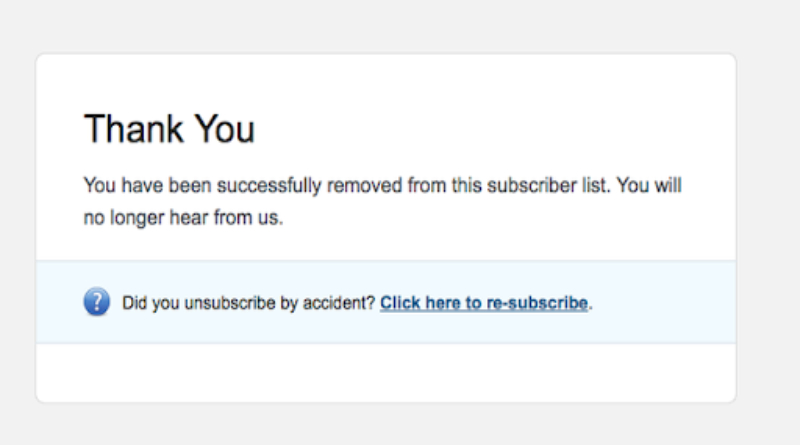
This design is simple and effective because of the large font that lets the user know that they’ve been successfully unsubscribed. The form also provides users with a quick and easy way to re-subscribe if they unsubscribe by accident.
Conclusion
There you have it. 8 tips to help you create compelling email unsubscribe pages so you can transform unsubscribe requests into opportunities for building stronger customer relationships.
Follow these tips to create a respectful and warm unsubscribe page that will work to your advantage by making subscribers change their minds about canceling the subscription or choose to stay connected with you through social media (or a condensed newsletter).
Even for those who still decide to leave, they will remember you fondly, making it more likely that they will recommend your business and products to their friends or even resubscribe in the future.
Which of these tips will you implement first to make unsubscribe pages work for you? Share your thoughts in the comments below!
Also Read: Christmas iPhone Production Shortages Have Affected Manufacturing Practices
Related posts
Hot Topics
Understanding TruthFinder’s Background Check Features
Background checks have become increasingly relevant for personal safety and information gathering in digital environments. TruthFinder offers comprehensive background check…
How MLOps Is Shaping the Future of AI in Business
Artificial intelligence (AI) has evolved from a futuristic idea to a strategic necessity for companies looking to innovate, grow, and…

